Begin with a feeling, then bring it into focus through color, fabric and the way your invitation opens. Six directions from our gallery, thoughtfully interpreted for your celebration.
From the Thai Silk Box collection · Personalised embroidery
Let the invitation set the mood.
Wedding ideas become more useful when they relate to your venue, stationery and personal taste. Explore six styling directions below. Select a photograph to inspect its details in the gallery, then share its reference when discussing your design.
01Photographed reference · G05
A soft, floral beginning.
Suggested palette · Blush · ivory · a touch of green
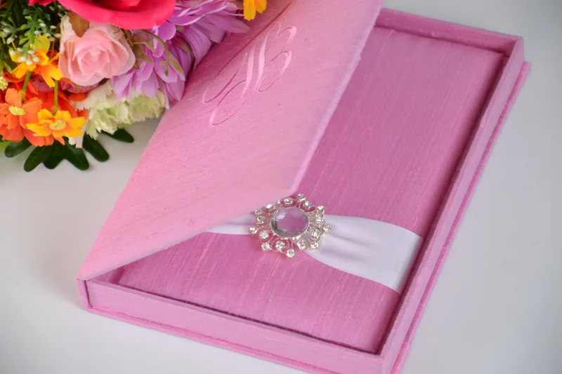
For a romantic garden setting, consider a soft pink invitation presentation with ivory stationery and a restrained floral illustration. Carry one flower or one shade into the reception details, rather than repeating every decorative element.
The open-box photograph lets you consider the inner panel and ribbon. Confirm that the full invitation suite fits comfortably before choosing the finished size.
Suggested palette · Aqua · white · tonal embroidery
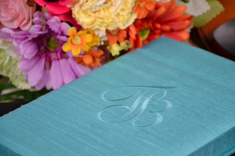
A fresh blue palette can suggest an airy daytime celebration or a coastal setting. Pair it with clear typography and white stationery; tonal embroidery adds a personal detail without creating another competing color.
The embroidered initial in this photograph is a reference. Your lettering, placement and artwork are reviewed through your own proof.
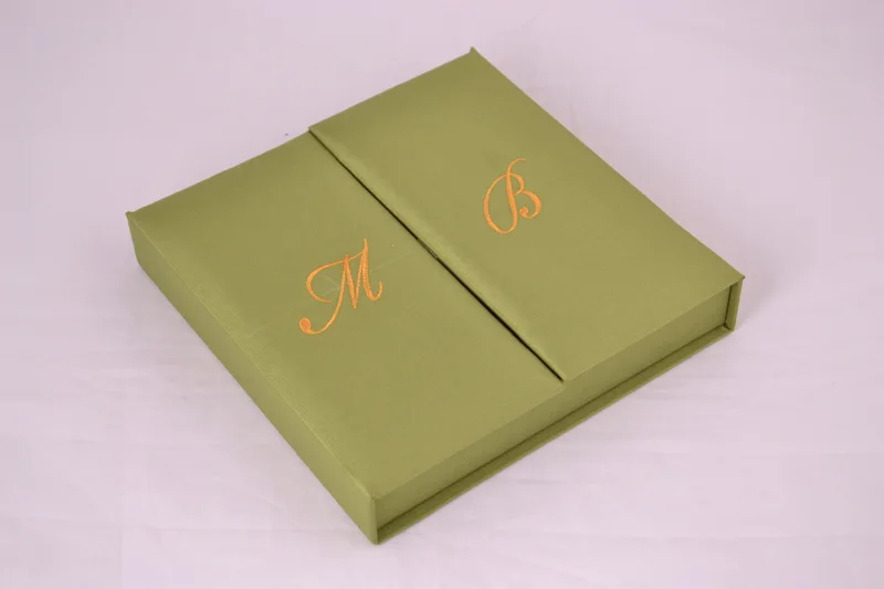
For wedding ideas inspired by greenery, begin with a muted green cover and a warmer accent. Choose cream paper and a small botanical detail, then let natural foliage carry the theme at the celebration.
Discuss the opening and initials together with the atelier, so their placement suits your chosen construction.
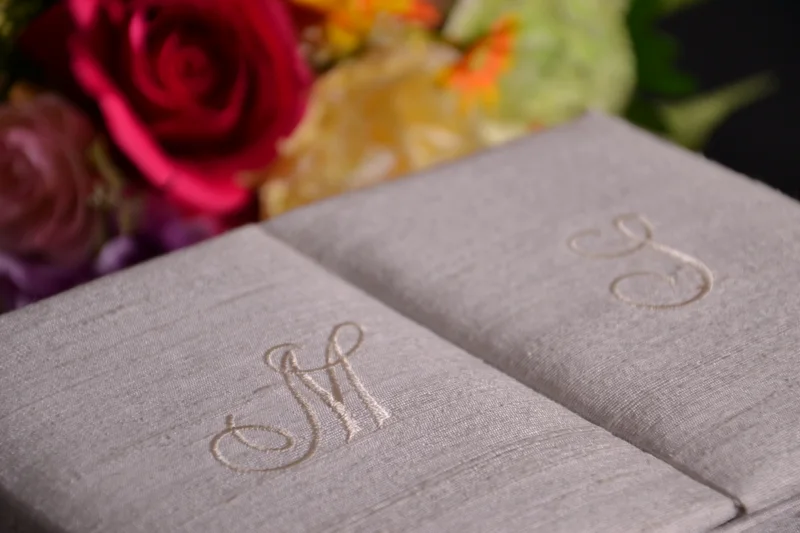
Suggested palette · Taupe · cream · a tonal signature
A neutral invitation can feel at home in an intimate restaurant, a formal townhouse or a contemporary venue. Keep the design spacious, with a clear type hierarchy and a monogram that is visible without overpowering the cover.
Neutral fabrics shift noticeably under different light. Review a physical sample beside your paper before confirming the palette.
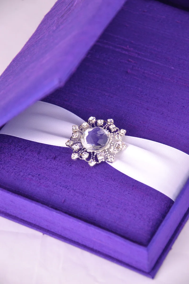
Suggested palette · Violet · pale ribbon · a jeweled accent
For an evening celebration, a deeper color gives the invitation a sense of occasion. Pale stationery and ribbon provide contrast; one jewel can be enough to complete the composition.
The open view is useful for discussing card placement and the proportions of the finishing detail. Confirm each element in the written specification.
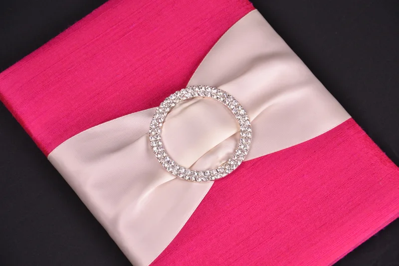
Suggested palette · Fuchsia · ivory · a little sparkle
A vivid pink can be the focal point of a joyful celebration. Repeat it in a few deliberate places, such as a floral accent or printed detail, and keep neighbouring colors quieter so the palette feels composed.
Use the close-up to compare ribbon and jewel proportions. The photographed combination is an example; available options are confirmed for your chosen product.
Consider the venue, time of day and the atmosphere you want guests to feel. Use these as a direction, rather than a rule that every detail must match.
Your stationery
Bring the finished card dimensions, envelopes and enclosures. Format and usable interior space matter as much as color.
Your personal detail
Choose the signature that means something to you: initials, an ornament, a ribbon or an unembellished cover. Review personalised artwork before production.
CONTINUE THE CONVERSATION
From wedding ideas to your invitation.
Bring a gallery reference and the details of your celebration. We will discuss what can be made, then confirm material, color, construction, price and delivery in your proposal. Photographs and on-screen palettes are illustrative; a physical sample is the best way to review color.